Evaluation & User Study
Heuristic Evaluation
- Error Prevention: There are no error messages that could tell the user if something is wrong
- Aesthetic and Design: Back buttons have the same color as every other button
- Flexibility and Efficiency: There are no shortcuts when using the app
- Visibility of System Status: Start screen doesn’t inform users what the app is about
Testable Questions
-
Can users complete the primary task without external help?
- User 1 needed a little help with finding out how the pet falls asleep. User 3 struggled with doing and understanding the daily quests
-
Where do users hesitate or make mistakes?
- User 3 hesitated and made mistakes while trying to figure out how to master dailies because he compared them with other video games.
- User 2 hesitated to delete the pet because of emotional bonding
-
Do users understand system feedback and error messages?
- User 3 understood the daily quests after reading through it
Data to Collect (Dependent Variables)
To evaluate usability and test the hypotheses, the following data will be collected:
Quantitative Data
-
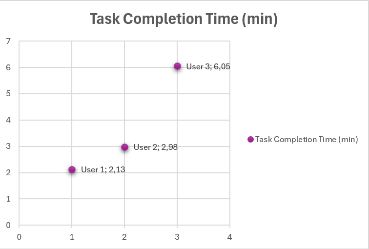
Task completion time (in minutes)
- User 1: 2:08, User 2: 4:59 (minus 2 minutes, because of duration of one of the dailies), User 3: 6:03
-
Task success rate (completed / not completed)
- Choose a pet: User 1 ✅, User 2 ✅, User 3 ✅
- Rename the pet: User 1 ✅, User 2 ✅, User 3 ✅
- Complete one daily: User 1 ✅, User 2 ✅, User 3 ✅
- Buy one thing in the shop: User 1 ✅, User 2 ✅, User 3 ✅
- Feed the pet: User 1 ✅, User 2 ✅, User 3 ✅
- Delete the pet: User 1 ✅, User 2 ✅, User 3 ✅
-
Number of errors per task
- All the users successfully completed all the tasks
-
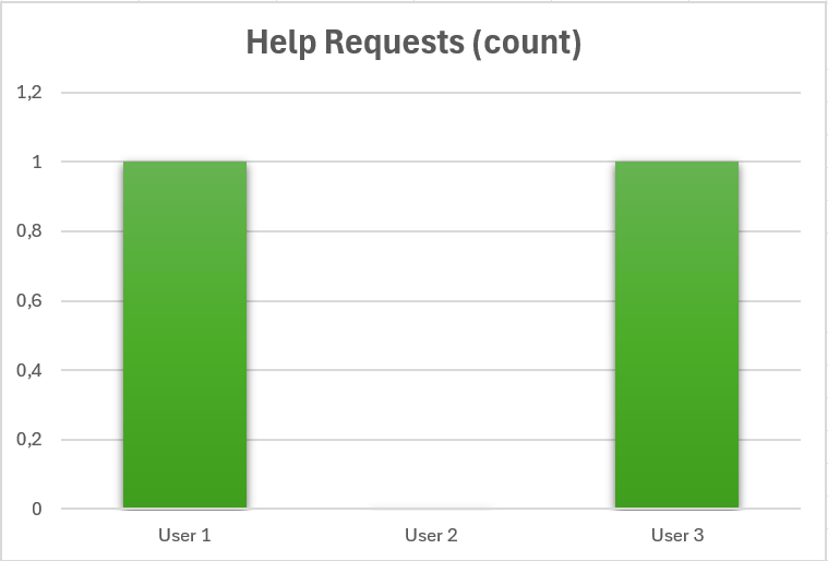
Number of help requests or hints needed
- User 1 had difficulties finding out how to make their pet fall asleep
- User 3 requested help after struggling with the daily quests
-
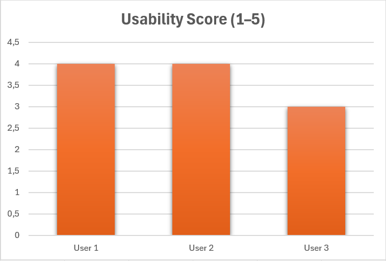
Questionnaire scores (e.g., usability rating)
- User 1 score 4/5
- User 2 score 4/5
- User 3 score 3/5
- 4+4+3 / 3 = 3.67 / 5
Qualitative Data
-
User comments and verbal feedback
- User 1 didn’t like the colors of the buttons in the first screen
- User 2 expressed distress regarding the delete button and the visibility of it
- User 3 said the back button when selecting a pet should be more visible, so it doesn’t look like a fourth option.
- He also thinks there is a lot of text in the daily window
-
Observed confusion or hesitation
- User 1 hesitated when it comes to making their pet fall asleep, but eventually figured out that playing with it might make it sleepy (like in real life)
- User 2 hesitated when deleting their pet
- User 3 had little to no experience with virtual pet apps and that’s why he struggled with the daily quests
-
Suggestions for improvement
- User 1 suggested making the buttons different colors
- User 2 and 3 both wished for more animations so the pet interacts back to the user and to hide the delete icon to prevent the feeling of dread
Interview (before testing)
-
How much experience do you have with virtual pet apps (scale from 1 to 10, 1 being no experience)?
- U1: 5
- U2: 8 to 9
- U3: 1
-
Do you recognize one of the following apps:
- Pou: U1 ✅, U2 ✅, U3 ✅
- Talking Tom: U1 ✅, U2 ✅, U3 ❌
- Ben: U1 ✅, U2 ❌, U3 ❌
-
What do you usually enjoy most in virtual pet games?
- U1: Customization and being able to have fun
- U2: Customization and a growing up feature
- U3: Exploration
-
How do you expect to interact with the pet?
- U1: Depends. Maybe you can touch it and have different reactions, feed it and different audio depending on the pet you choose
- U2: Feed it, clean the mess they make, wash it and maybe change the bed and toys of the pet
- U3: Feed it, maybe Minigames like going on a walk, customization and a shop to buy items in
Interview (after testing)
-
What was your first impression of the app?
- U1: It looks nice and fun and the designs are cute
- U2: The drawings are cute
- U3: I couldn’t guess what the app will be about based on the first screen, but the drawings are cool and it’s very nice that it’s all hand drawn
-
Were any buttons, icons or actions confusing?
- U1: I had difficulties finding out how to make the pet fall asleep
- U2: No
- U3: The back button looked like a fourth option, the trash icon was visible and distracting, I expected the dailies to be interactable
-
Did you feel emotionally connected to the pet? Why or why not?
- U1: Of course! I got to name it, feed it and at the end I had to delete it
- U2: Yes, because I named it after my real pet and it looked cute
- U3: Only when I ultimately killed (deleted) it, otherwise no, because you can interact with the pet, but the pet doesn’t interact back
-
What did you like most about the app?
- U1: The ability to choose which pet you want, the different skins, that you can name the pet and the customization
- U2: The art and that you can buy different food
- U3: The shop reminded me of the time when I played Nintendogs and I really wanted to buy everything in the shop, but it was pet based so I couldn’t buy everything, but in Petco I had a big selection of stuff
-
If you could change one thing, what would it be?
- U1: The colors of the buttons. The blue doesn’t fit the background
- U2: The dailies, because I didn’t want to abandon my pet. Also maybe add animations and the trash icon should be hidden
- U3: The animals need to interact with the user, maybe thanks to animations and the deletion is too easy. I would also change “delete pet” to “give up for adoption” so it doesn’t seem too harsh
Overalls the test users had little to no difficulties when navigating the app. There were concerns regarding the delete icon and that it’s too open. It gives the users the feeling of stress and unease when the delete icon is visible. User 1 talked about color changes for the buttons in the first screen, because they seemed too standard and didn’t match the background. All three of the users like that the app is all self-drawn and gave good feedback about the cute drawings. User 3 had difficulties with the daily quests, because he thought they were interactable and stated that because of prior experience with other games, where you press on one quest to choose it, he felt confused. User 2 felt very emotional and said that some daily quests, like the quest where you must drop either the love or hunger bar to zero, feel like the user must abandon the pet to complete it. Overall the users enjoyed the experience and would play the app in its finished form.
Materials & Tools
Prototype
- App made in Android Studio
Questionnaires
- Structured interview
Observation Tools
- Screen recording
- Think-aloud protocol (users explain what they are doing)